1.3. Climate Analysis Part 1: Visualizing Weather Data with CBE Clima Tool#
1.3.1. Get weather file#
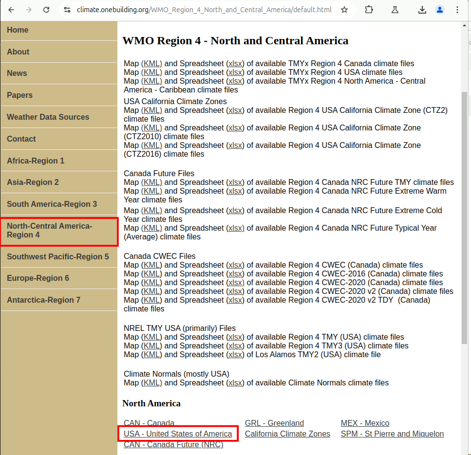
Go to climate.onebuilding.org. Go to North-Central America-Region 4 -> North America USA - United States of America.
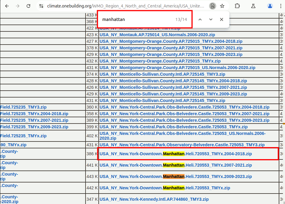
At the United States page. We will use ‘ctrl+f’ to search for ‘manhattan’. It is the 13/14 search as shown below. Click on the link and download it.
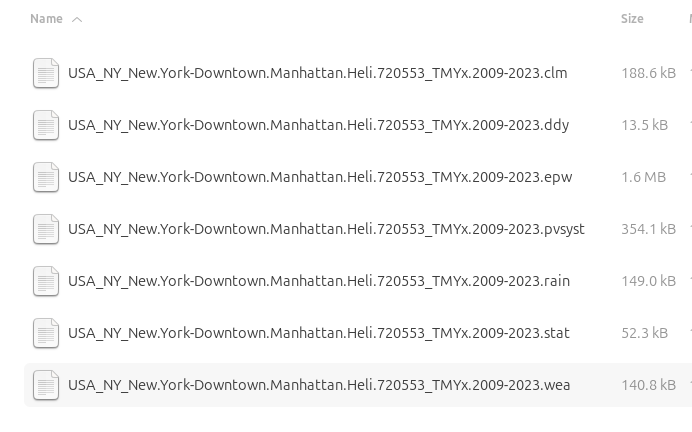
Unzip the file. You will see 7 files. We will only be using the data from the .epw file. Here is a brief description of the files.
.clm: weather file for the simulation software ESP-r
.wea: weather file for the daylight simulation software daysim
.PVSyst: weather file for the daylight simulation software PVsyst
.ddy: design day file
.rain: precipation data in m/hr if available
.stat: energyplus weather statistics
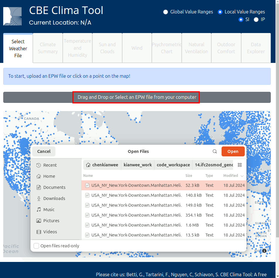
1.3.2. Load weather file with CBE Clima Tool#
Now we will go to the CBE Clima Tool. At the page, click on ‘Drag and Drop or Select an EPW file from your computer’ and select the New York Manhattan file .epw file we downloaded.
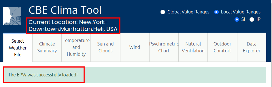
It will load the weather file as shown below.
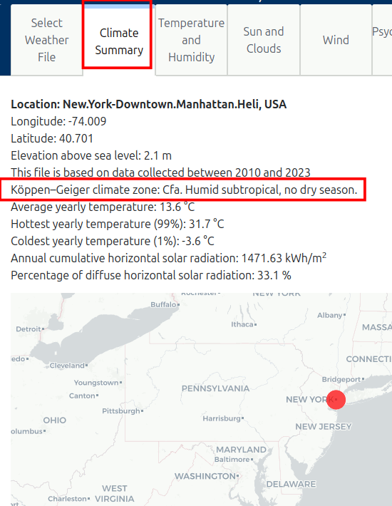
Go to the ‘Climate Summary’ tab. We can see a brief summary of the climate and the Köppen-Geiger climate classification. The Köppen-Geiger climate classification is a system that categorizes climates into 5 main groups based on temperature and precipitation patterns. New York is classified as Cfa, where C(Temperate), f(No dry season) and a(hot summer), which means it is a humid subtropical climate.
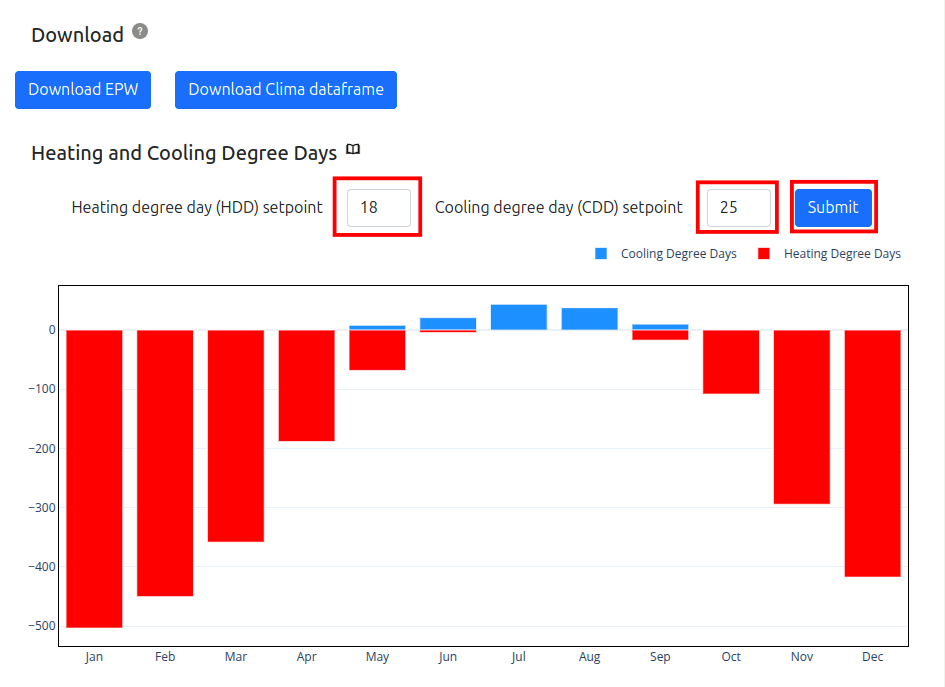
Scroll down and you will see the ‘Heating and Cooling Degree Days’ section. Adjust the HDD (Heating Degree Day) setpoint to 18 degC and CDD (Cooling Degree Day) setpoint to 25 degC and press submit. Looking at the graph, you will get a sense if the climate is a heating or cooling dominant climate. In the case of New York, it is obviously a heating dominant climate.
However it is important to note, CDD is not a good indication for how much cooling is required, as a majority of cooling is dehumidification which is not capture by the dry bulb temperature.
1.3.3. Temperature and Humidity#
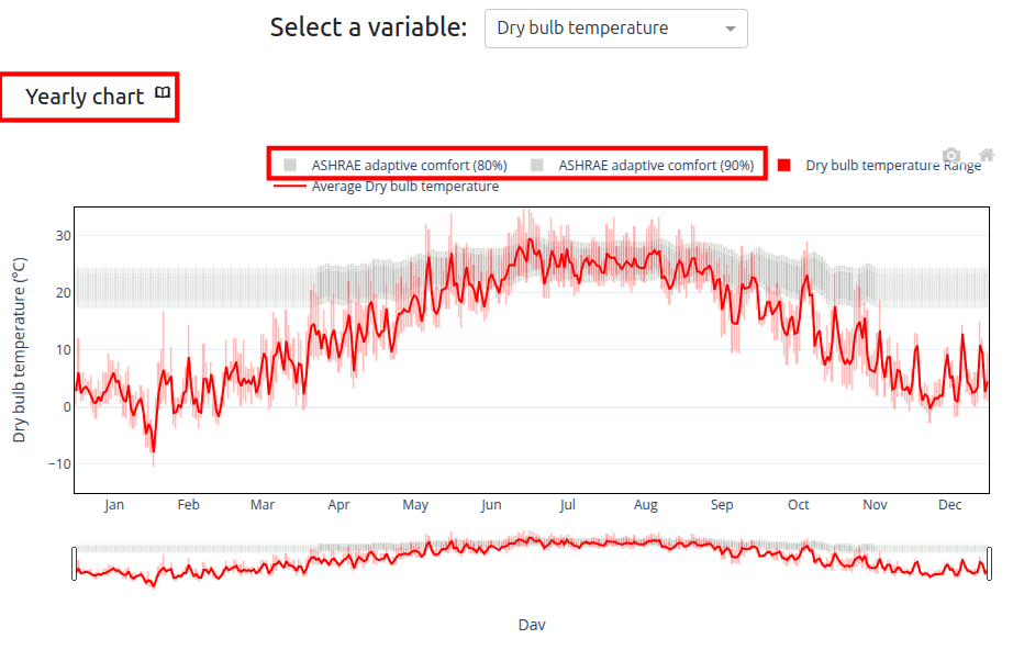
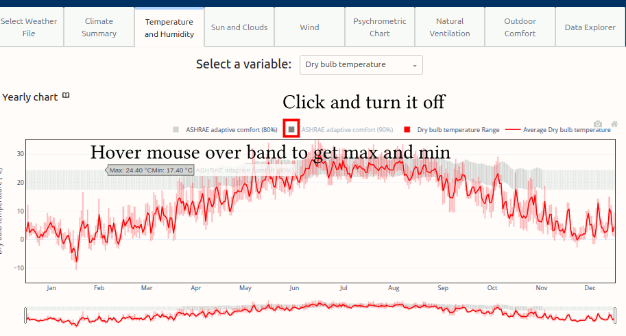
Next, we look at the ‘Temperature and Humidity’ tab. The Yearly Chart shows the temperature distribution throughout the year. You can click on the little book icon beside the chart to go to an explanation page. The grey band is the ASHRAE adaptive comfort band. If the temperatures fall within it, it means that 80%-90% of the occupants will feel comfortable at that temperature.
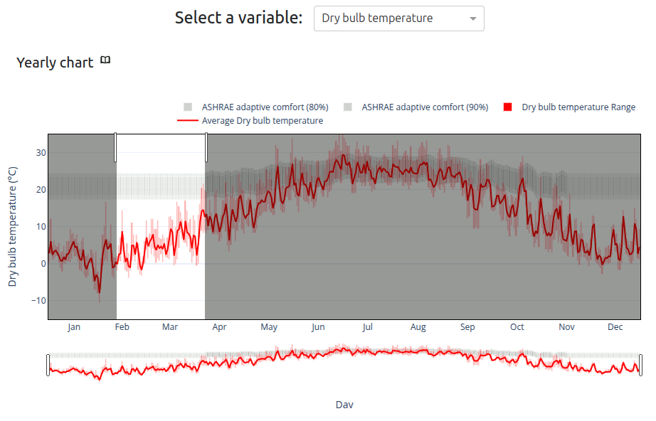
You can zoom into the data by clicking and dragging on the graph as shown below.
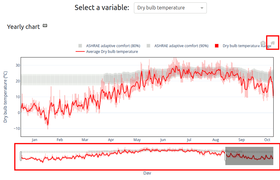
You can zoom out by clicking and dragging the bar below the graph. You can also reset the axes by clicking on the home icon. You can also turn on and off data by clicking on the legend.
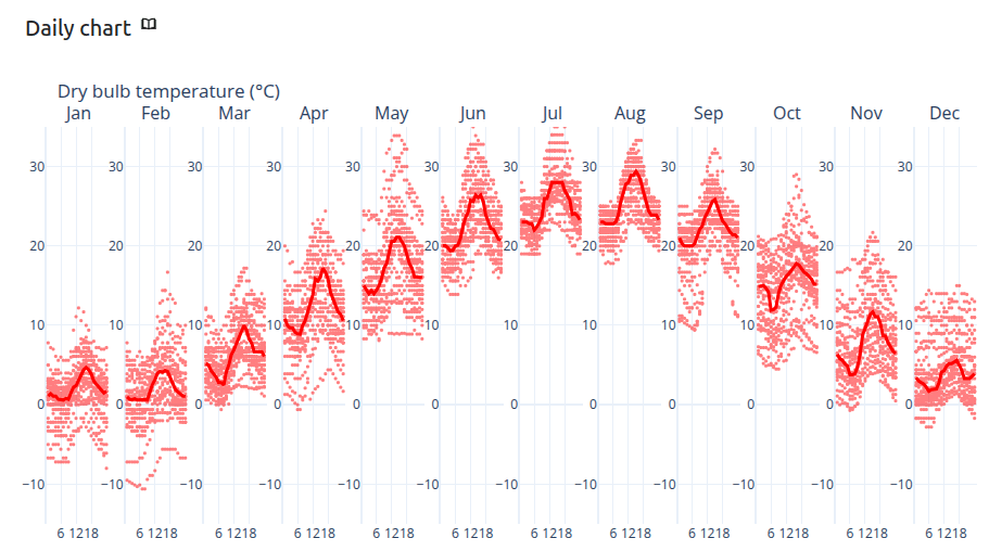
Next, we look at the Daily Chart. It shows the condition of an average day of each month.
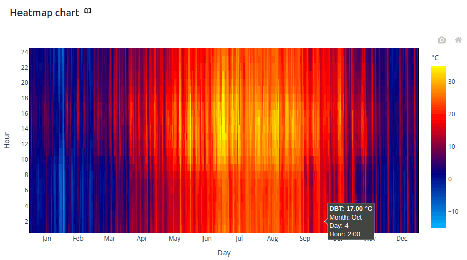
Next, we look at the Heatmap Chart. The x-axis is 365 days of the year and the y-axis is 24 hours of a day. There is a gradient legend correlating the color to the temperature.
1.3.4. Sun, wind, natural ventilation and outdoor comfort#
In the Sun and Clouds tab, you will be able to see the sun path and the daily chart of the horizontal solar irradiation received. Knowing the position of the sun throughout the day is incredible useful when thinking of installing PV solar panels on your building. This helps maximize the amount of solar energy captured and electricity generated by the panels. Similarily, it informs the placement of windows to allow for maximum heat gain in the winter months and shades in the summer months.
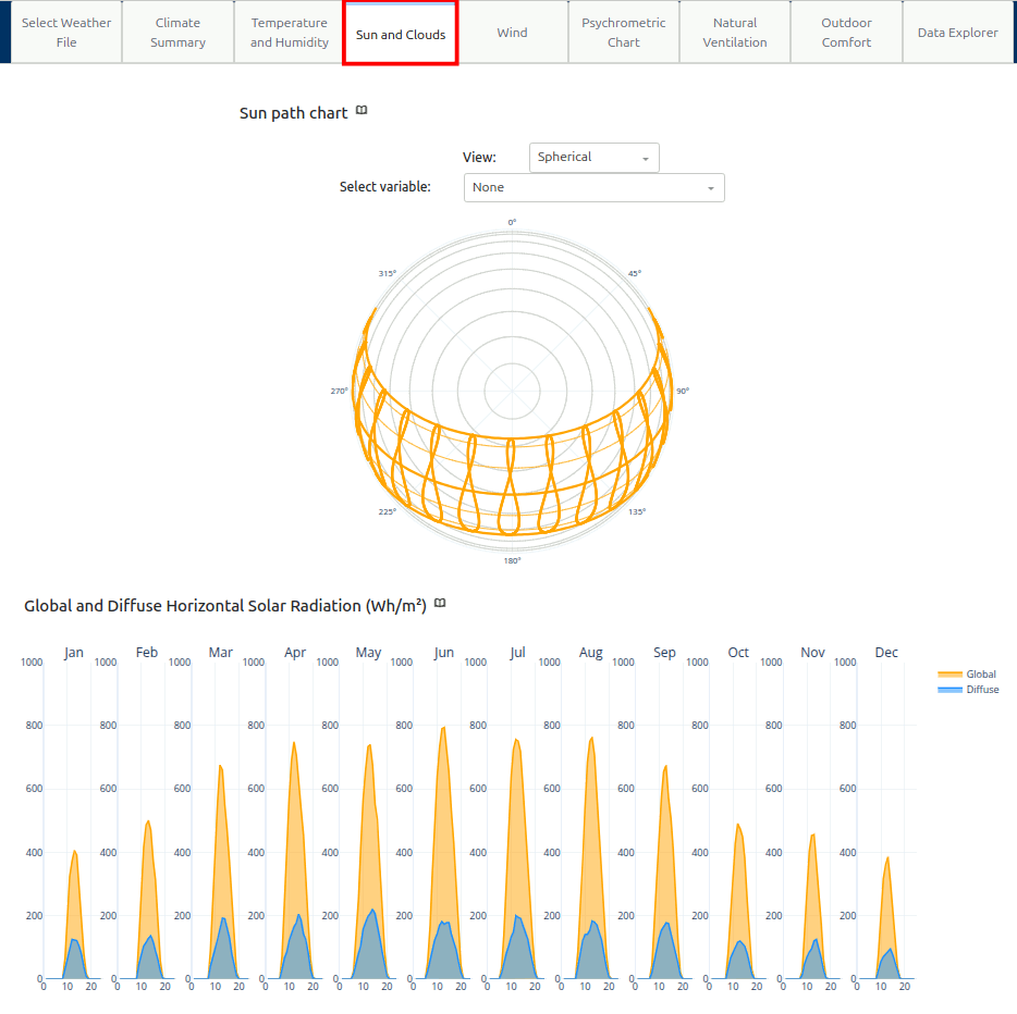
Global Horizontal Solar Radiation (in Watt-hours/meters squared) is the amount of solar radiation a horizontal surface recieves directly from the sun’s beam, while Diffuse is how much solar energy reaches after being scattered by particles and molecules in the atmosphere.
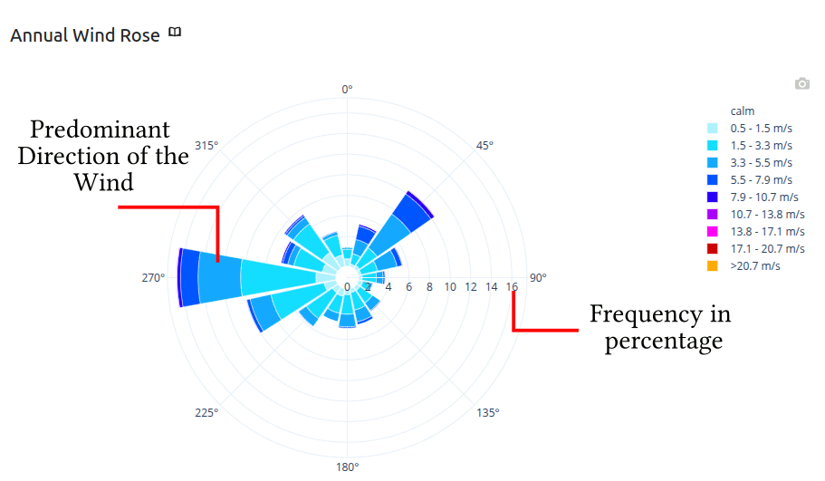
In the Wind tab, the wind rose diagram helps visualize wind speed, direction and frequency. By interpreting this, you can identify predominant wind patterns that strongly influence building performance and thermal comfort. Wind data informs window placement and ventilation design. Using natural airflow lowers reliance on mechanical cooling systems, which in turn decreases cooling loads and saves energy. Wind also creates pressure differentials across the building surface, causing infiltration (unwanted outdoor air entering) and exfiltration (conditioned air escaping) that make a building less energy efficient. These both increase heating and cooling loads. Because of this, wind has a direct impact on loads. Buildings in windy climates need careful design-tight envelopes, air barriers, and strategic window placement-to control these effects while still allowing for natural ventilation. In design, it mostly comes down to a balance of energy efficiency with comfort.
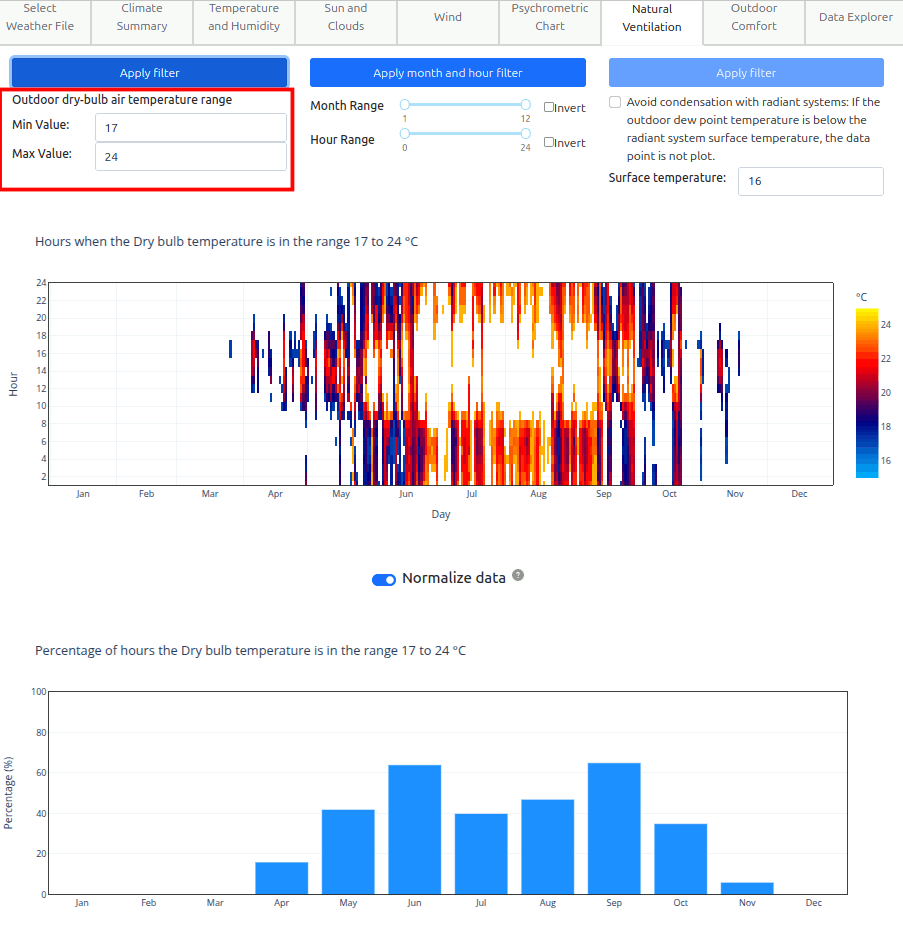
The Natural Ventilation tab allows the user to set a minimum and maximum air temperature range that is suitable for natural ventilation. Buildings can open windows and does not require HVAC. The above diagram, heat map shows when this condition is satisfied. The below diagram shows for each month what are the percentage of days the condition is satisfied. We can see that in New York, Spring and Autumn has very high natural ventilation potential if the range is between 10-24 degC.
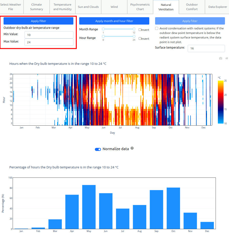
However, 10-24 degC feels like too big of a range. Lets go back to Temperature and Humidity tab, and get the ASHRAE adaptive comfort 80% range, use the min and max temperature as the range for natural ventilation potential. The min = 17.4 degC and max = 24.4 degC.
Now lets change the Natural Ventilation min/max to the ASHRAE adaptive comfort 80% band. The tool does not allow decimal places. So lets input 17 degC and 24degC. We can see the potential is reduced and the potential shifted to the summer season.
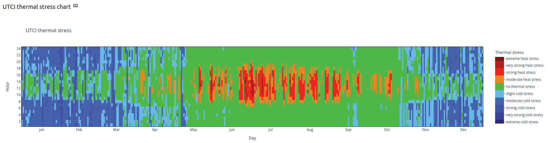
Universal Thermal Climate Index (UTCI) is used for assessing Outdoor Thermal Comfort. Click on the Outdoor Thermal Comfort tab, looking at the UTCI thermal stress chart you can see when there is very high thermal stress outdoor. From May to Sep, high thermal stress is experience during day time. These are very useful information for designing outdoor spaces.